As an art director, designer, & illustrator, I make complex stories more natural to understand in any medium. Motion graphics allow the viewer to imaginatively immerse themselves in a story; interactive media, meanwhile, allows the viewer to actively participate in the story's creation.
our future, together
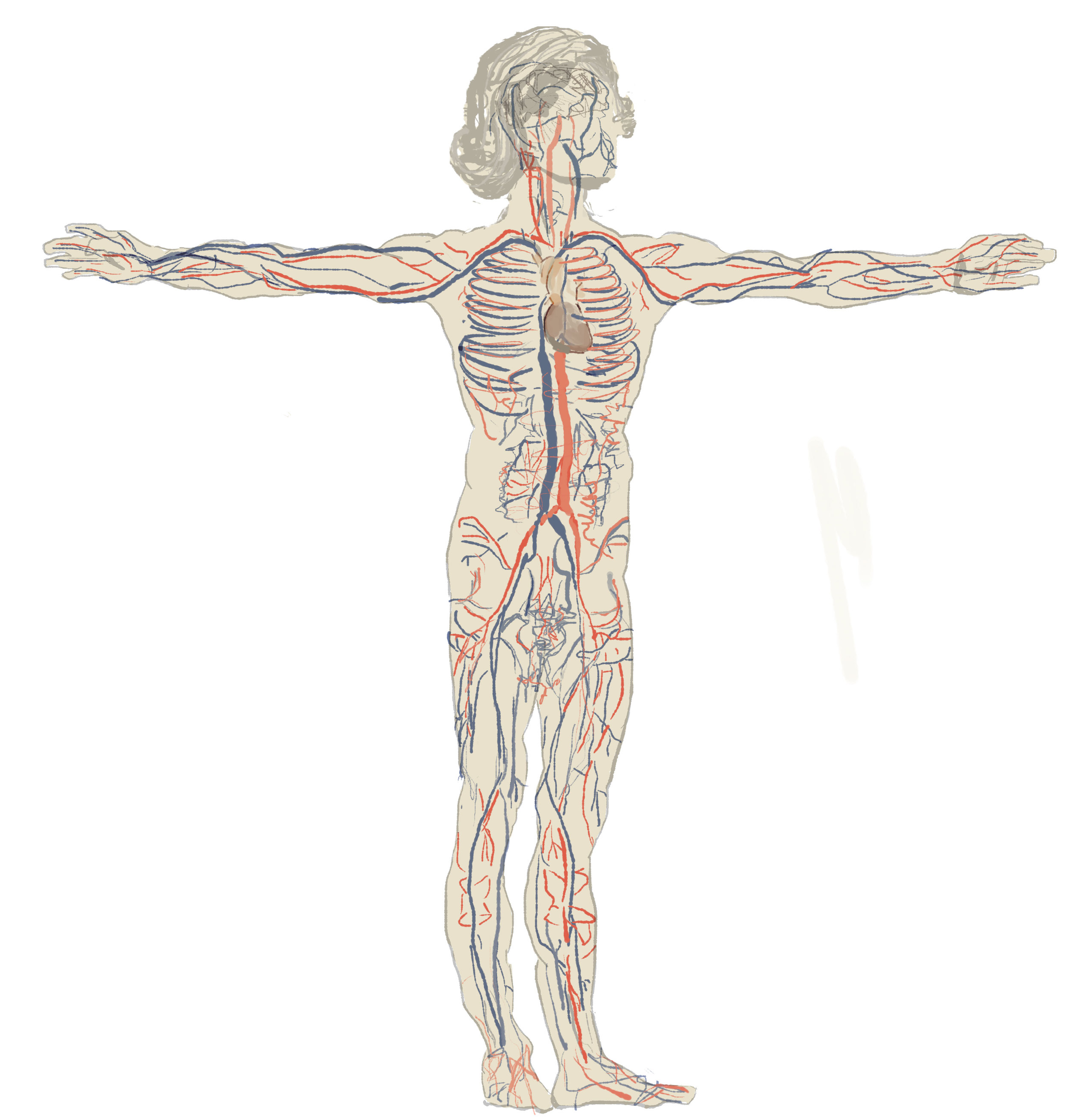
With my team at Graphicacy, I storyboarded, designed, illustrated, and art directed a motion graphics video and interactive package for the Center for American Progress. For a general audience, we translated a research report, by John Pitkin and Dowell Myers, about immigrants and their contribution to economy. The project was designed to educate rather than compel users to take action.
art for music video
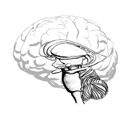
In collaboration with Noisy Neighbor TV, I created the art for a music video by the Brooklyn band Throw Vision—an 8-bit treasure map of the hippocampus, the seahorse-shaped center of memory in our minds. The video is directed by the talented Noah Hutton. It's a wonderful tune!
periodic table of u.s. state boundaries
In collaboration with my talented team at Graphicacy and historian Karl Phillips, I art directed a fun way to explore an obvious yet overlooked vector into United States history: A Periodic Table of U.S. State Boundaries. How did the boundaries between the states get set in the way we see them today? Why does Missouri have the bootheel and why does Idaho have a stovepipe hat (not to mention famous potatoes)?
scientific american interactive
I was at the American Museum of Natural History in New York one day when I encountered the scalloped trunk of a bristlecone pinetree, its rings circling back nearly 5,000 years. I compared that tree's life with that of the humble mayfly, which lives for only a day. In collaboration with my design team at GRAPHICACY, we visualized the longevity of record-holders from the bristlecone pine tree to the fruit fly (the mayfly proved a bit too ephemeral to chart!) My personal idea and the needs of Scientific American happily coincided here, as they were looking to complement an article about longevity in their July 2012 edition with a Graphic Science final page, which is reserved for information graphics each issue. The final product: we created an interactive for Scientific American's iPad app and a print design for the magazine, taking into consideration the reader's needs and creating experiences that reflect the intrinsic natures of each medium—one new; the other in existence since 12th-Century Japan.
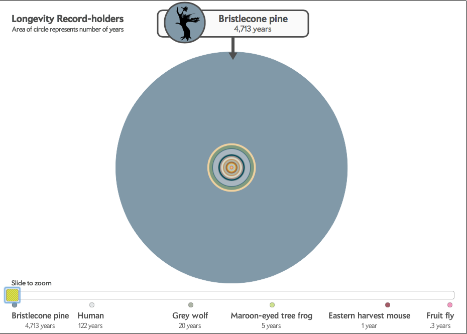
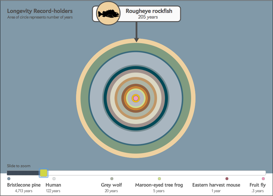
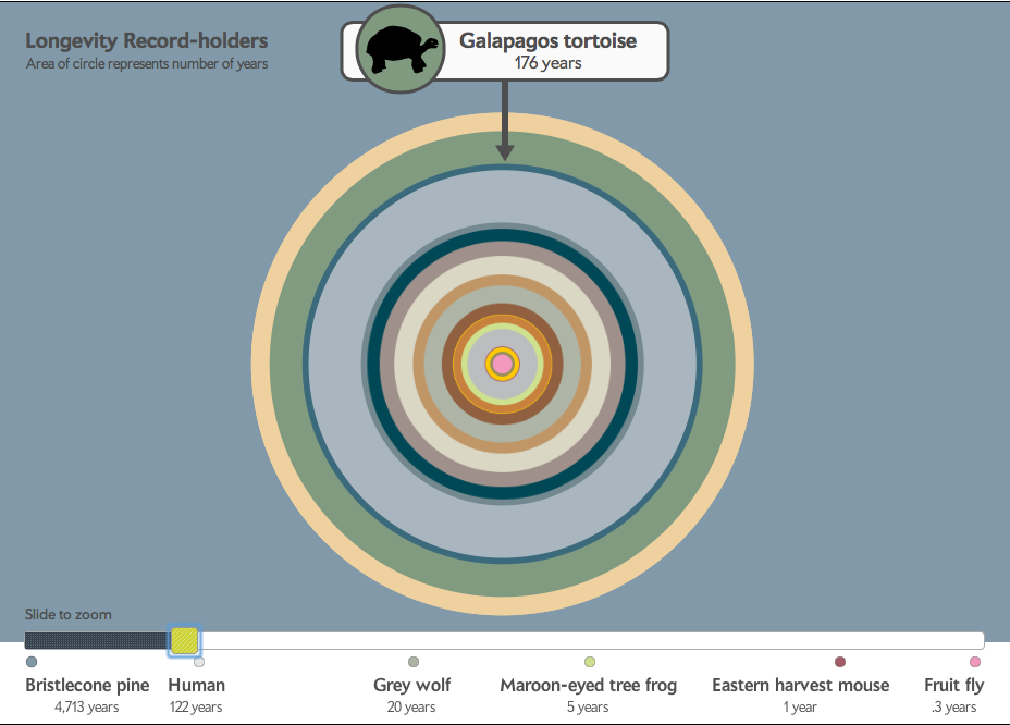
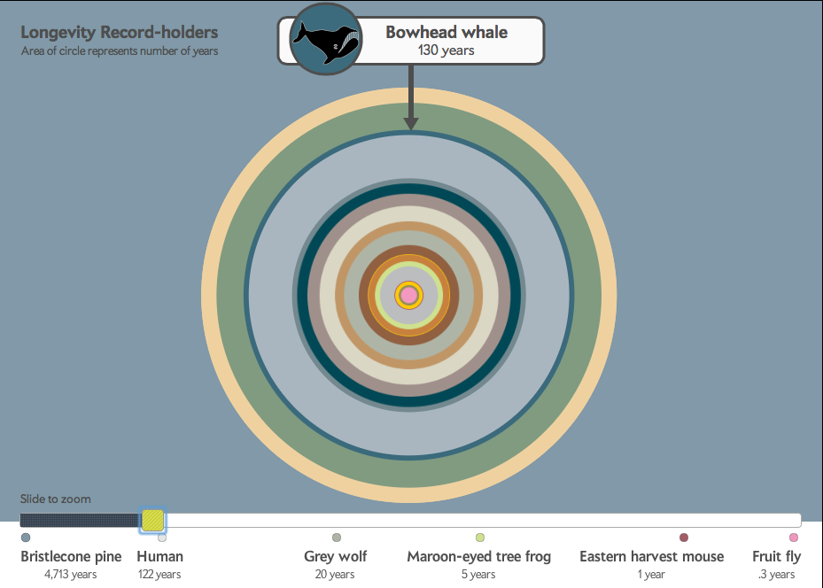
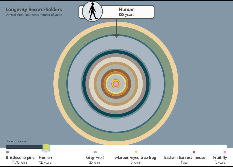
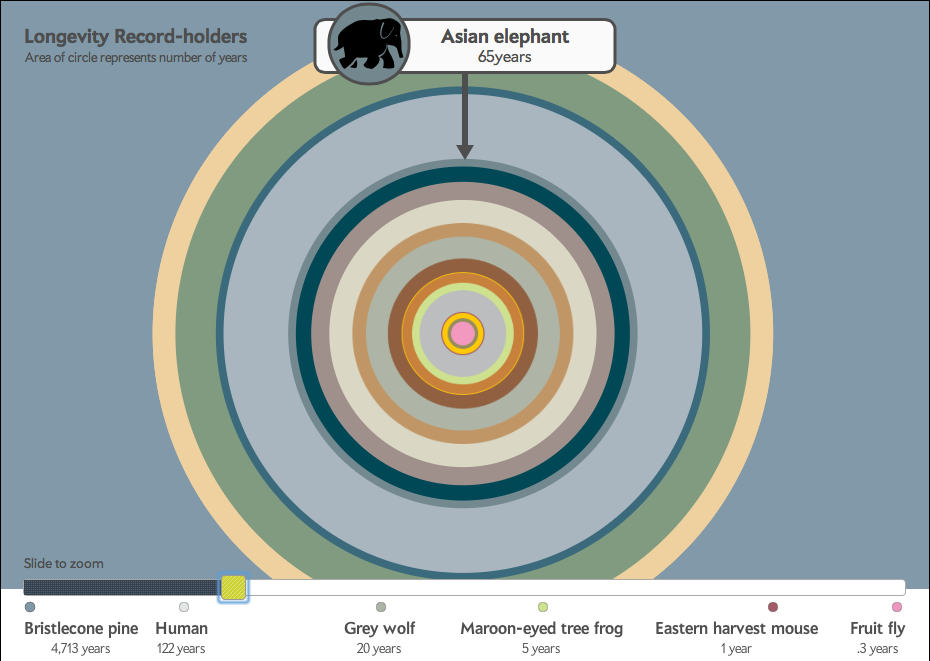
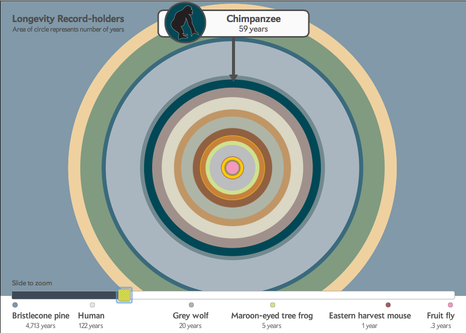
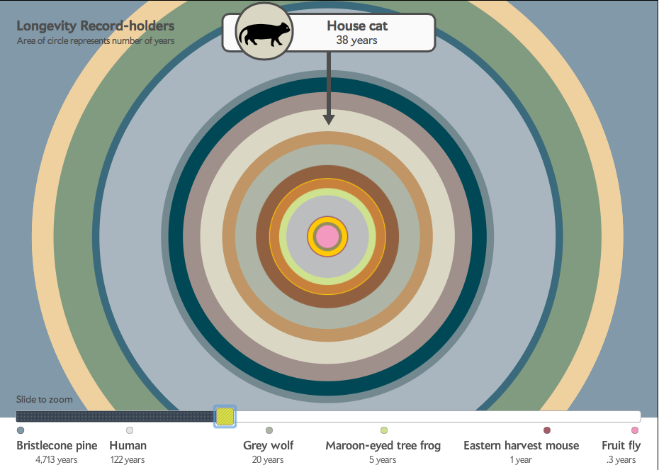
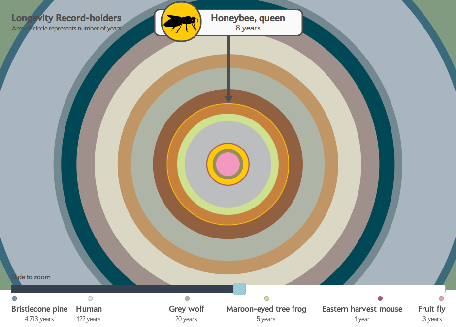
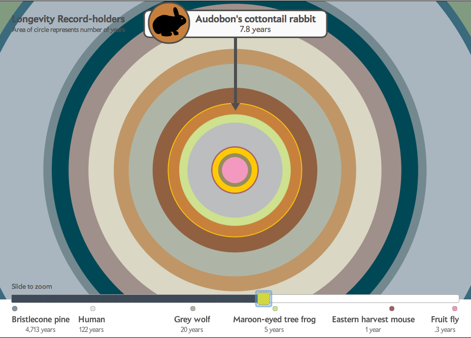
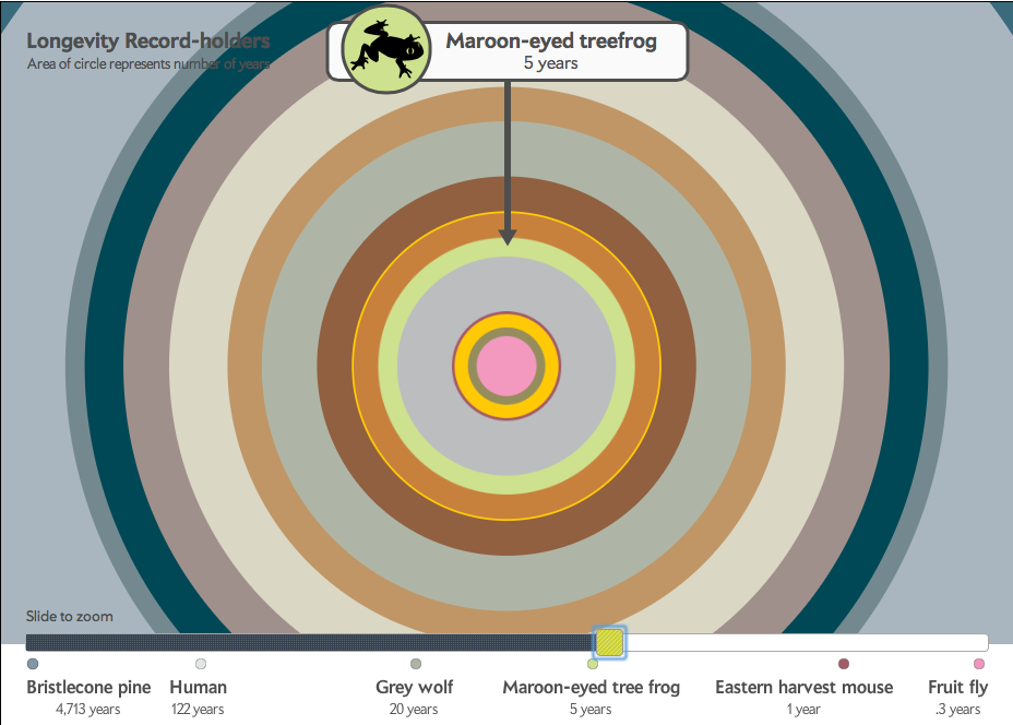
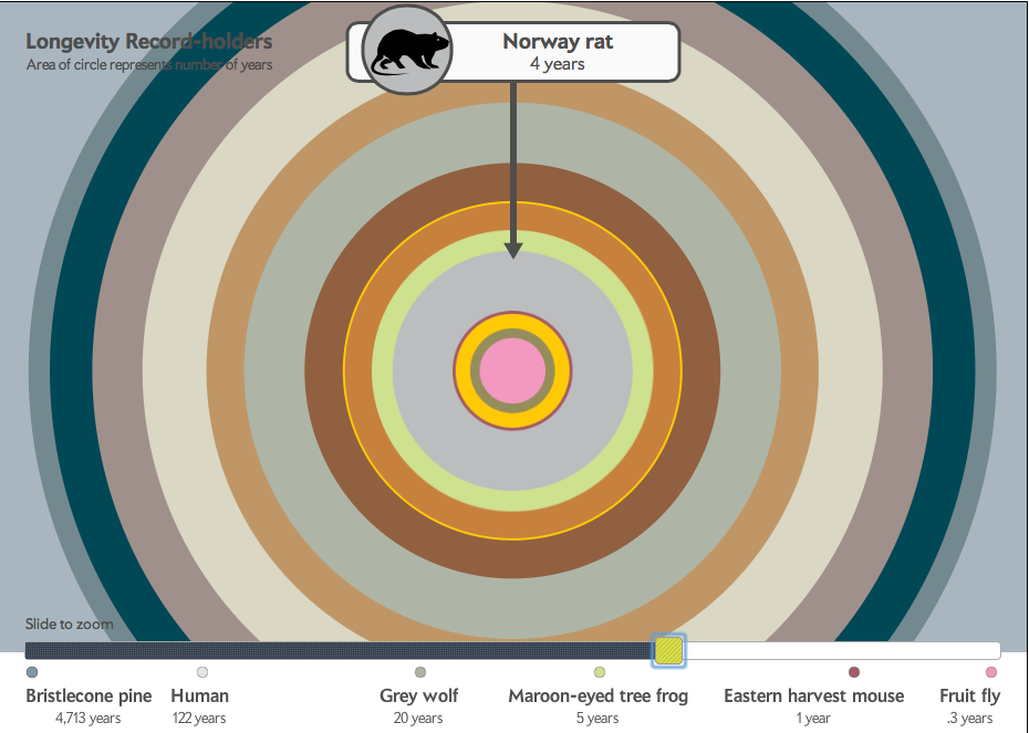
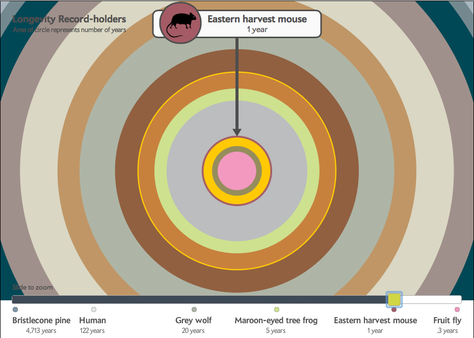
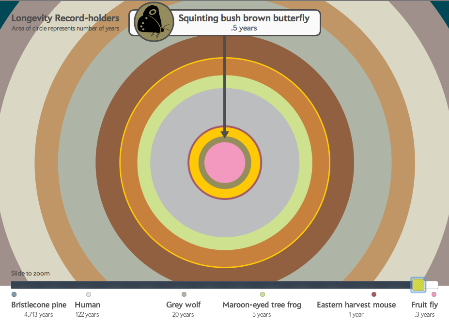
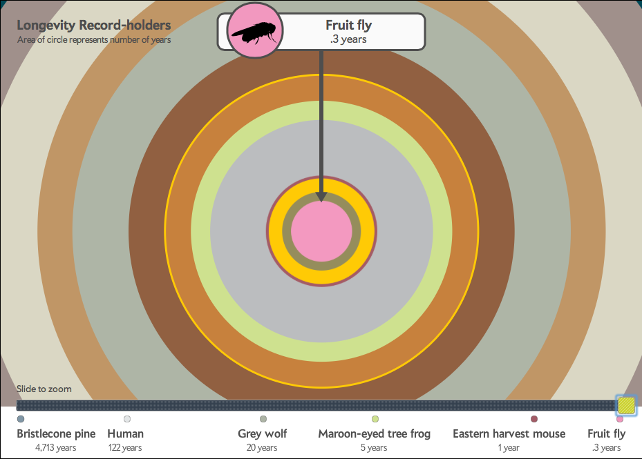
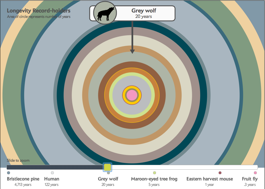
This interactive for the iPad complemented our design for the print magazine.
Graphic Science, Scientific American, July 2012. Art & research by Graphicacy
scientific american film series
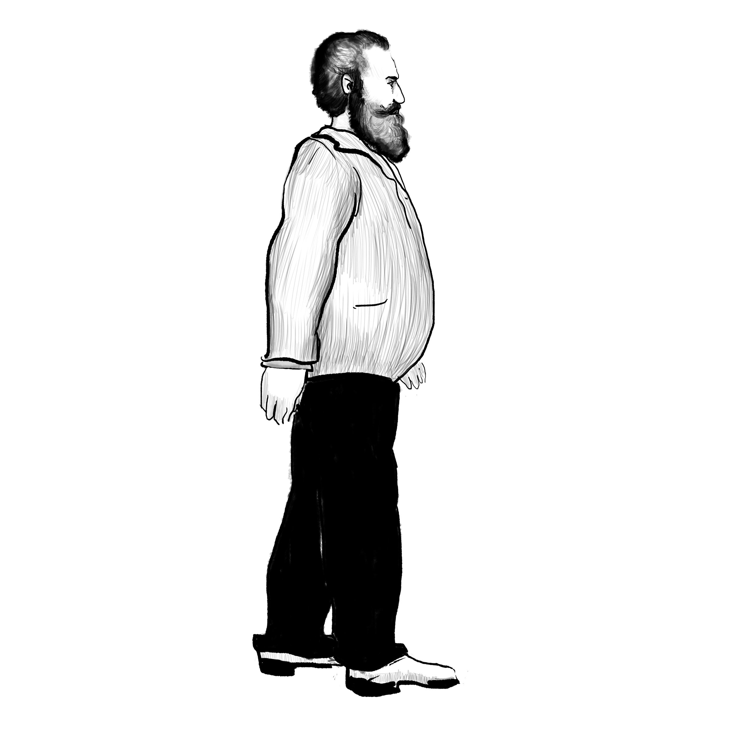
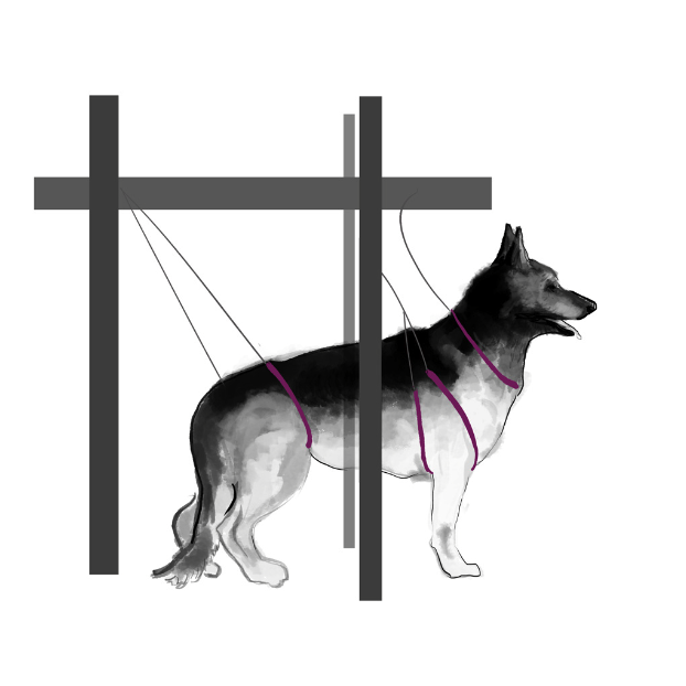
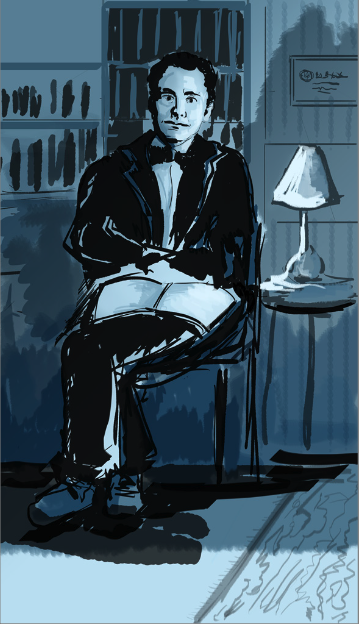
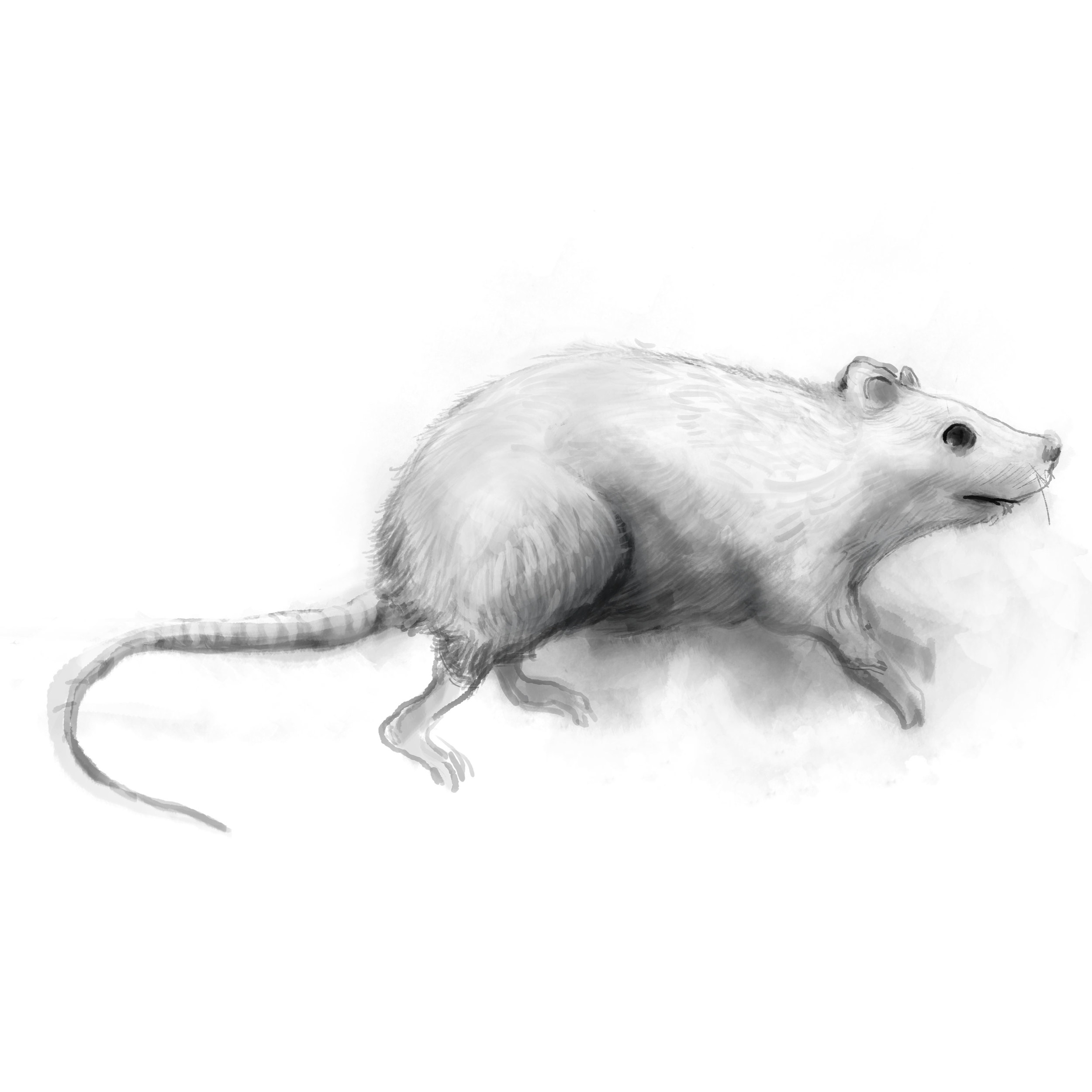
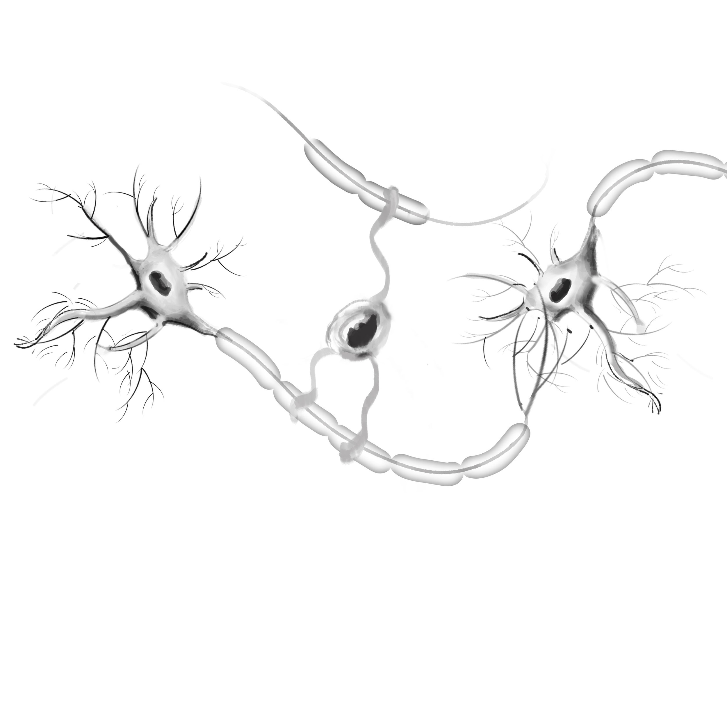
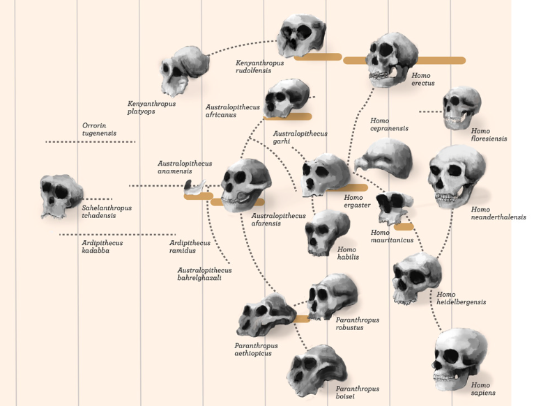
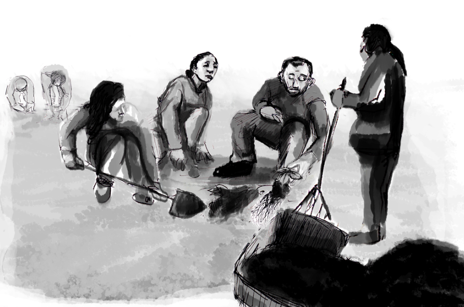
I worked as an artist on a film series about psychology for Scientific American (Anthony Kraus, motion graphics; Noah Hutton, director.) We opted to give the animated art a stop-motion, early 20th-Century feel. I enjoyed drawing Pavlov and his dogs! Please view the trailer and sample art below.
live drawing for stone soup films & dc greenworks
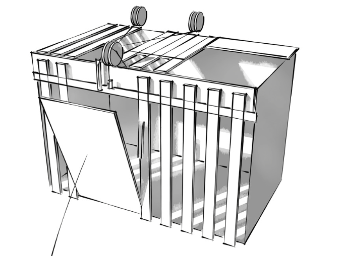
Dc Greenworks installs green roofs on buildings in DC, which can dramatically reduce the amount of pollutants carried off by rain into the city's sewers, which pours into the rivers. To communicate their story, the filmmaking team at Stone Soup Films hired me to live-draw the fundamental concept of greenroofing. Here is the raw footage.
I drew some mallards that swim in the local rivers to practice my live-drawing session.
Logo design, in collaboration with Anthony Kraus
web prototypes
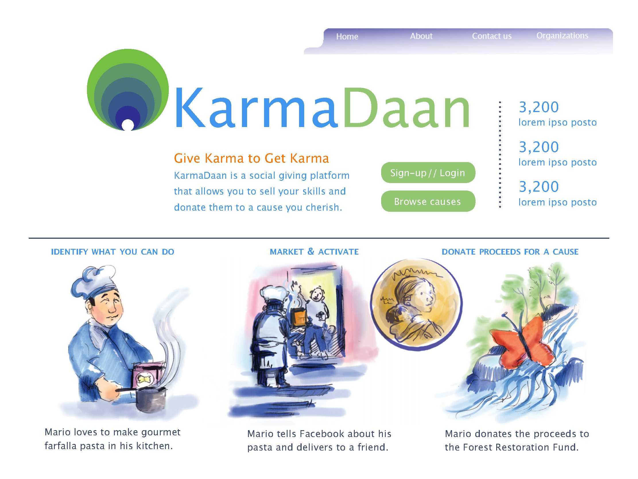
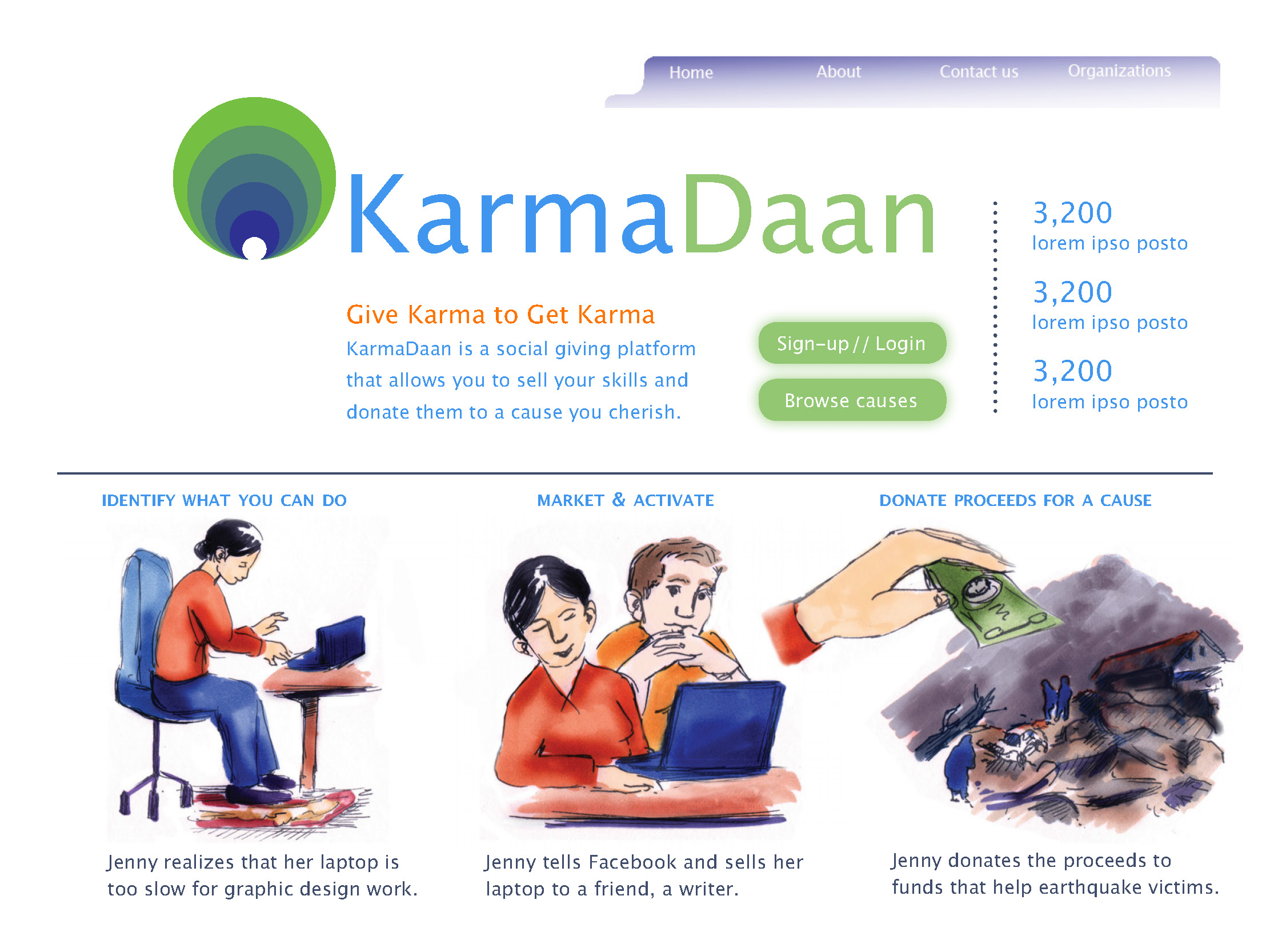
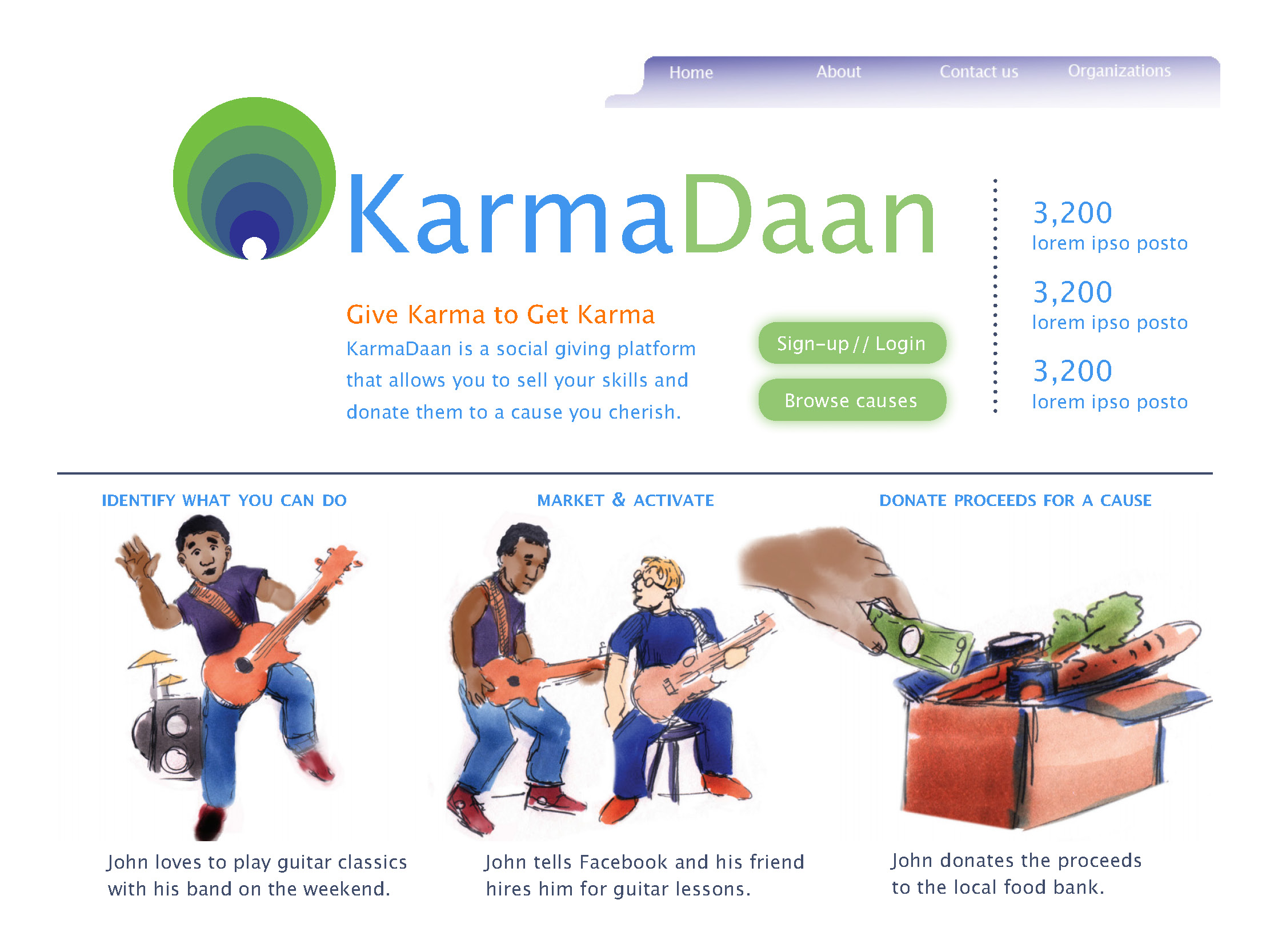
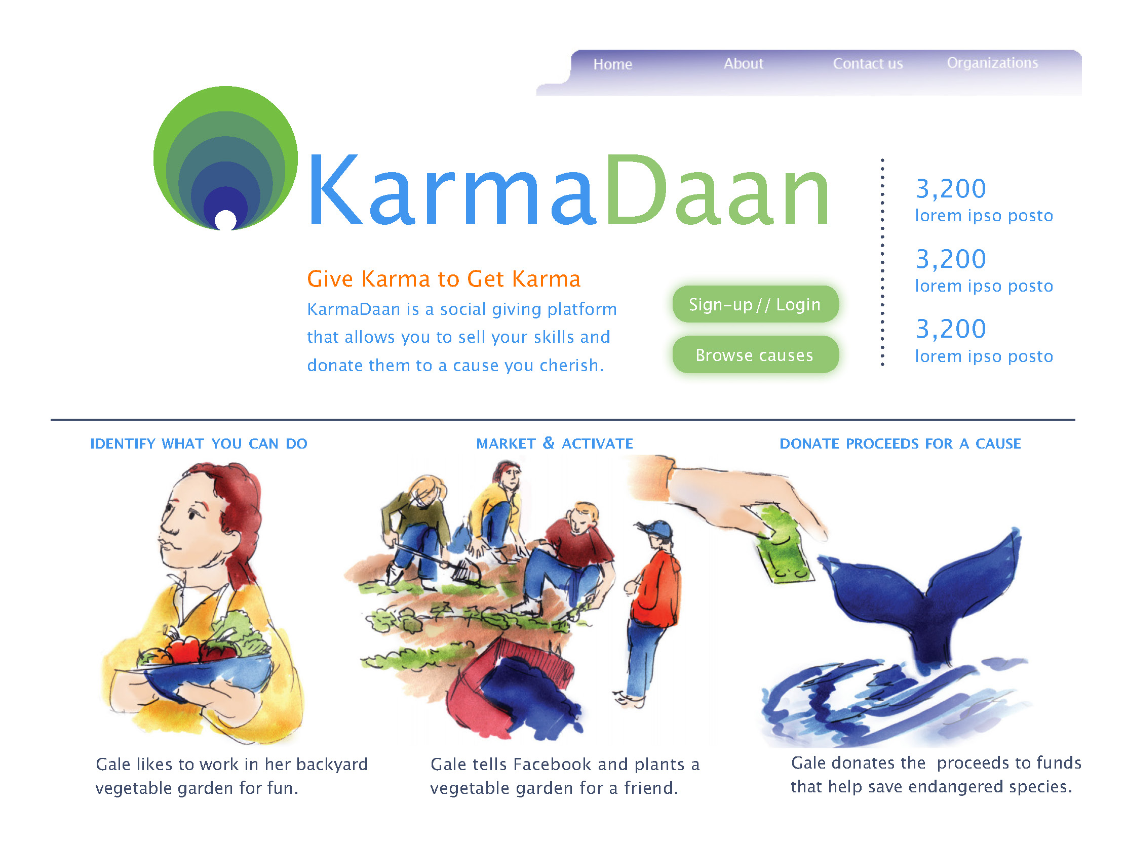
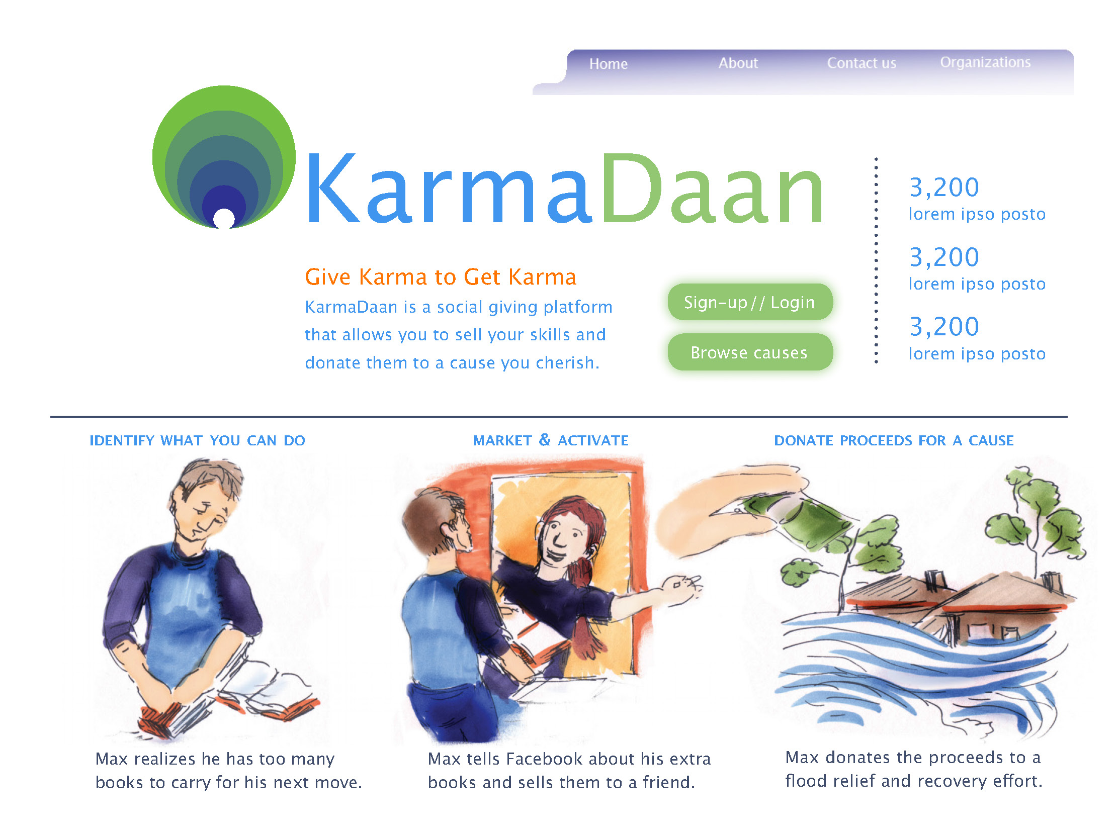
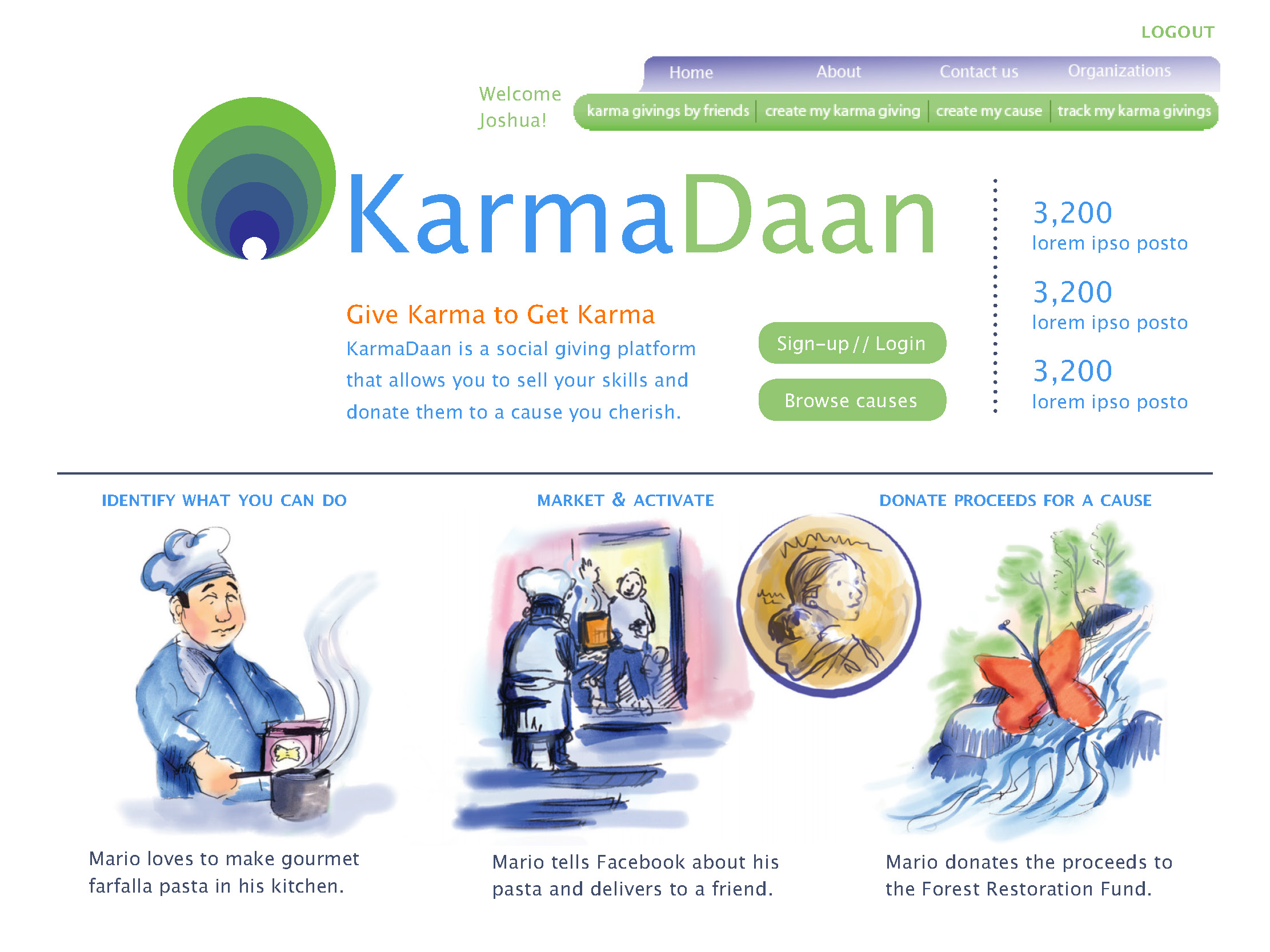
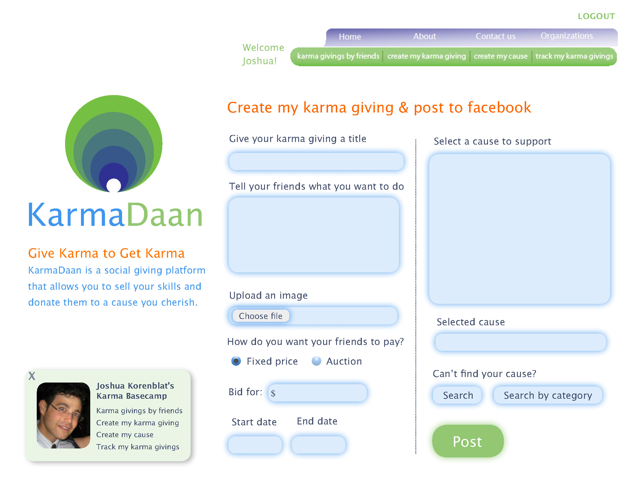
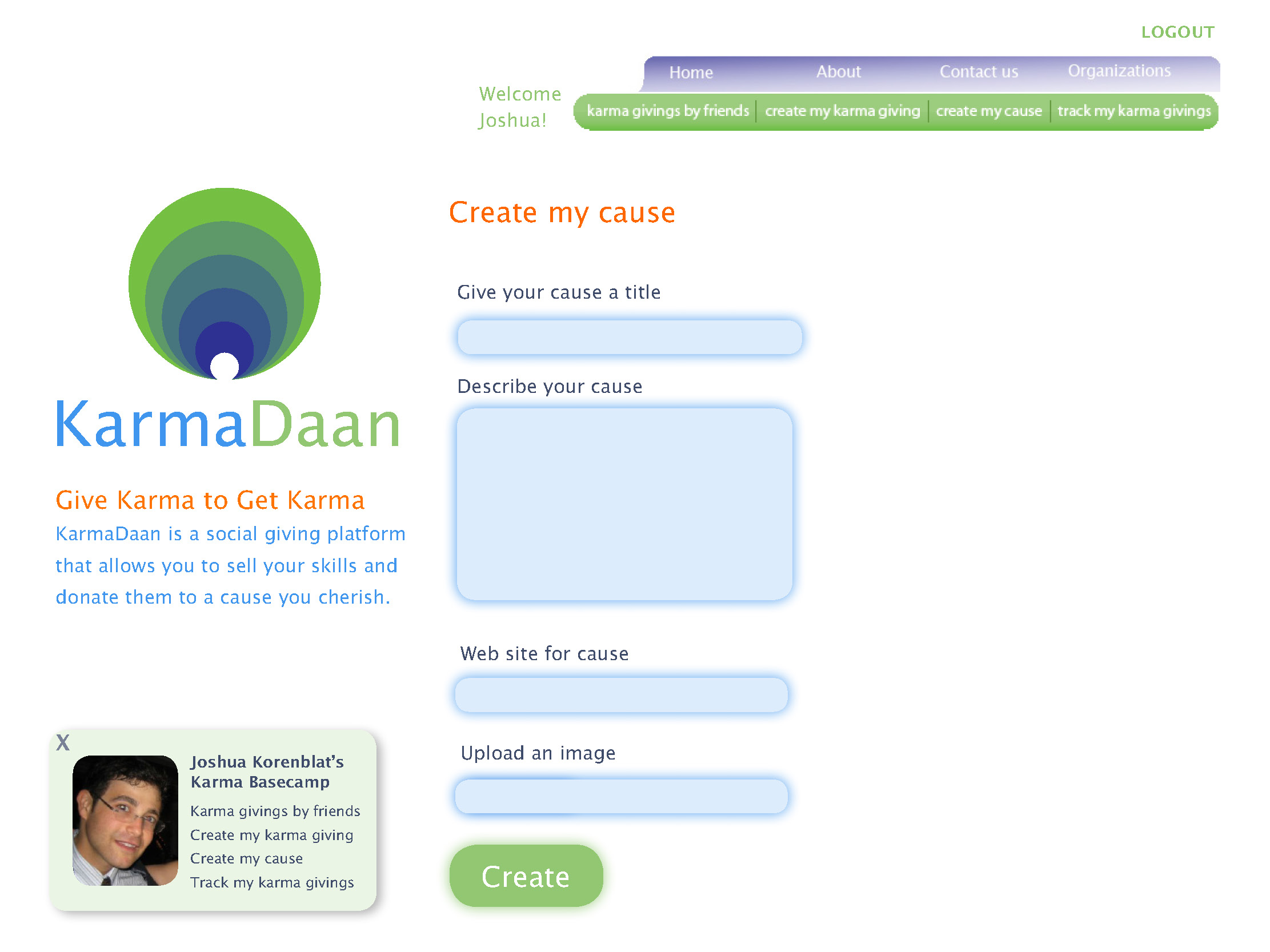
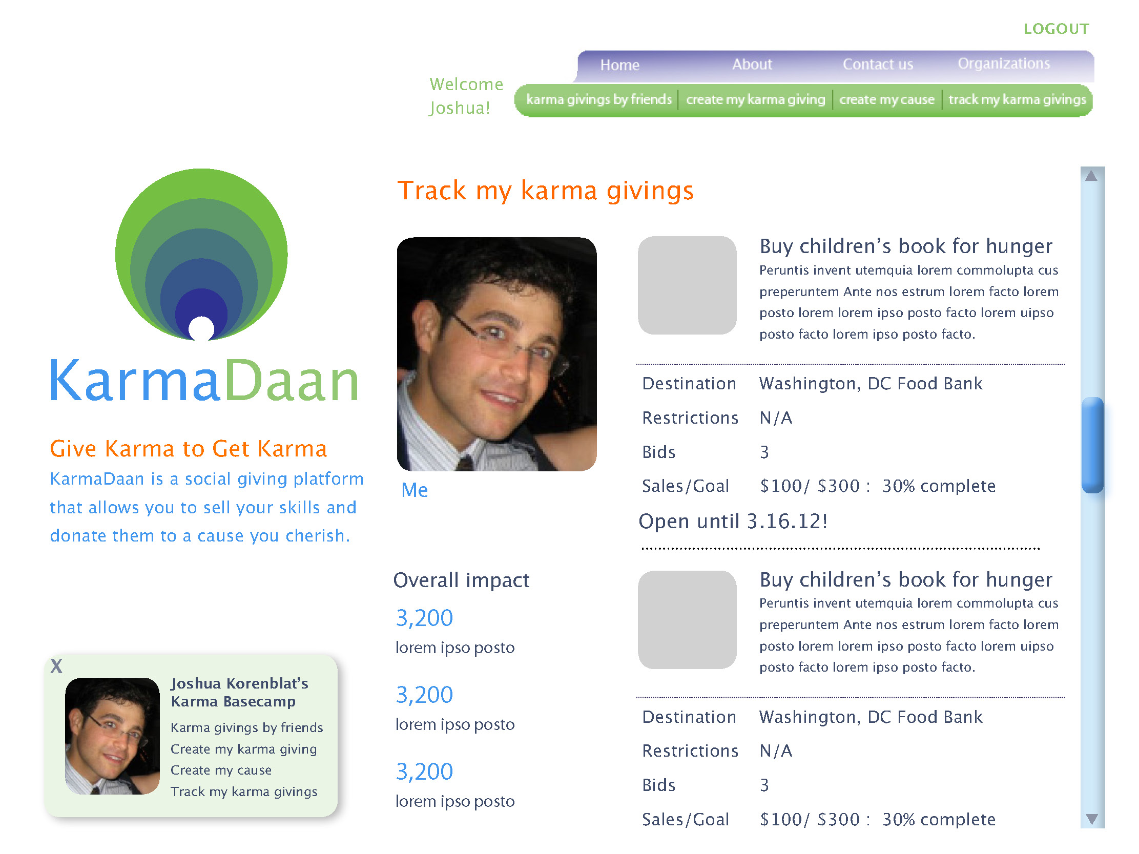
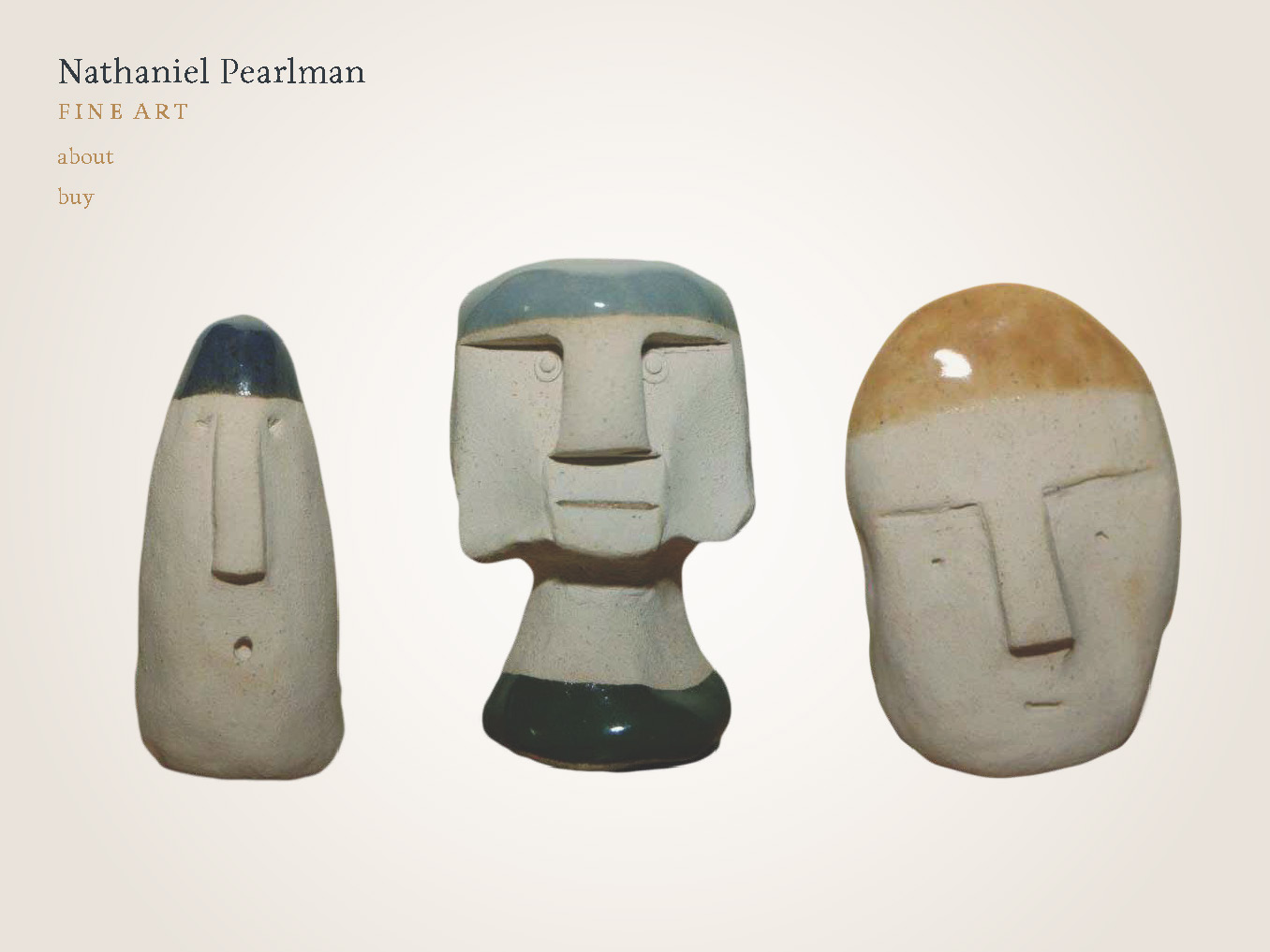
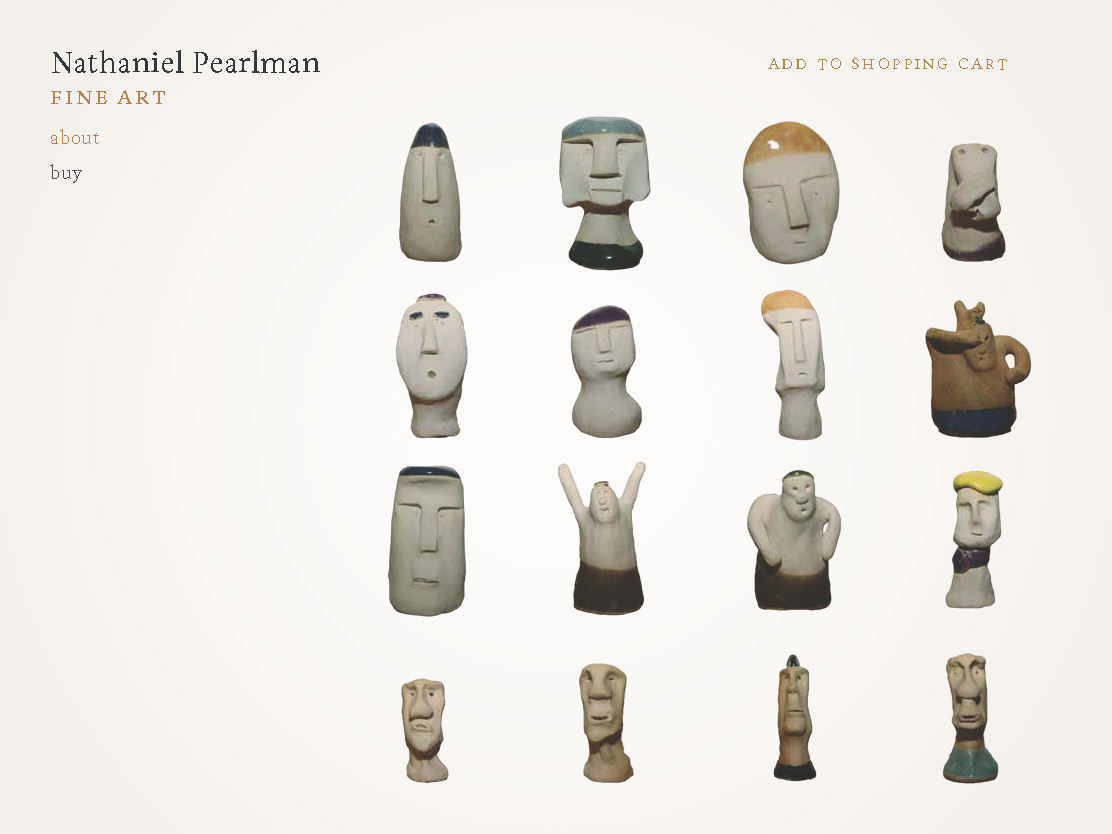
This year, I've designed two prototype web sites: KarmaDaan, a social giving network founded by Neeraj Jaiman. I also created the illustrations and narratives describing how the site works in a friendly way. The second prototype is for Nathaniel Pearlman's Random Clay Figurines web site, a funny, charming art-commerce site in which the user receives a random clay figurine from the artist. I was amused by the playful contours of the art, and accentuated the playful forms by not keeping them in picture boxes.
